Statistics Essentials For Dummies (6 page)

The standard deviation has the same units as the original data, while variance is in square units.
Percentiles
The most common way to report relative standing of a number within a data set is by using
percentiles
. A percentile is the percentage of individuals in the data set who are below where your particular number is located. If your exam score is at the 90th percentile, for example, that means 90% of the people taking the exam with you scored lower than you did (it also means that 10 percent scored higher than you did.)
Finding a percentile
To calculate the
k
th
percentile (where
k
is any number between one and one hundred), do the following steps:
1. Order all the numbers in the data set from smallest to largest.
2. Multiply
k
percent times the total number of numbers,
n
.
3a. If your result from Step 2 is a whole number, go to Step 4. If the result from Step 2 is not a whole number, round it up to the nearest whole number and go to Step 3b.
3b. Count the numbers in your data set from left to right (from the smallest to the largest number) until you reach the value from Step 3a.
This corresponding number in your data set is the
k
th
percentile.
4. Count the numbers in your data set from left to right until you reach that whole number.
The
k
th
percentile is the average of that corresponding number in your data set and the next number in your data set.
For example, suppose you have 25 test scores, in order from lowest to highest: 43, 54, 56, 61, 62, 66, 68, 69, 69, 70, 71, 72, 77, 78, 79, 85, 87, 88, 89, 93, 95, 96, 98, 99, 99. To find the 90th percentile for these (ordered) scores start by multiplying 90% times the total number of scores, which gives 90%
×
25 = 0.90
×
25 = 22.5 (Step 2). This is not a whole number; Step 3a says round up to the nearest whole number — 23 — then go to step 3b. Counting from left to right (from the smallest to the largest number in the data set), you go until you find the 23rd number in the data set. That number is 98, and it's the 90th percentile for this data set.
If you want to find the 20th percentile, take 0.20 ∗ 25 = 5; this is a whole number so proceed to Step 4, which tells us the 20th percentile is the average of the 5th and 6th numbers in the ordered data set (62 and 66). The 20th percentile then comes
to
.
The median is the 50th percentile, the point in the data where 50% of the data fall below that point and 50% fall above it. The median for the test scores example is the 13th number, 77.
Interpreting percentiles
The U.S. government often reports percentiles among its data summaries. For example, the U.S. Census Bureau reported the median household income for 2001 was $42,228. The Bureau also reported various percentiles for household income, including the 10th, 20th, 50th, 80th, 90th, and 95th. Table 2-1 shows the values of each of these percentiles.

Looking at these percentiles, you can see that the bottom half of the incomes are closer together than are the top half. The difference between the 50th percentile and the 20th percentile is about $24,000, whereas the spread between the 50th percentile and the 80th percentile is more like $41,000. And the difference between the 10th and 50th percentiles is only about $31,000, whereas the difference between the 90th and the 50th percentiles is a whopping $74,000.
A percentile is
not
a percent; a percentile is a number that is a certain percentage of the way through the data set, when the data set is ordered. Suppose your score on the GRE was reported to be the 80th percentile. This doesn't mean you scored 80% of the questions correctly. It means that 80% of the students' scores were lower than yours, and 20% of the students' scores were higher than yours.
The Five-Number Summary
The five-number summary is a set of five descriptive statistics that divide the data set into four equal sections. The five numbers in a five number summary are:
1. The minimum (smallest) number in the data set.
2. The 25th percentile, aka the first quartile, or Q1.
3. The median (or 50th percentile).
4. The 75th percentile, aka the third quartile, or Q3.
5. The maximum (largest) number in the data set.
For example, we can find the five-number summary of the 25 (ordered) exam scores 43, 54, 56, 61, 62, 66, 68, 69, 69, 70, 71, 72, 77, 78, 79, 85, 87, 88, 89, 93, 95, 96, 98, 99, 99. The minimum is 43, the maximum is 99, and the median is the number directly in the middle, 77.
To find Q
1
and Q
3
, you use the steps shown in the section, "Finding a percentile," where
n
= 25. Step 1 is done since the data are ordered. For Step 2, since Q1 is the 25th percentile, multiply 0.25 ∗ 25 = 6.25. This is not a whole number, so Step 3a says round it up to 7 and proceed to Step 3b. Count from left to right in the data set until you reach the 7th number, 68; this is Q1. For Q3 (the 75th percentile) multiply 0.75 ∗ 25 = 18.75; round up to 19, and the 19th number on the list is 89, or Q3. Putting it all together, the five-number summary for the test scores data is 43, 68, 77, 89, and 99.
The purpose of the five-number summary is to give descriptive statistics for center, variability, and relative standing all in one shot. The measure of center in the five-number summary is the median, and the first quartile, median, and third quartiles are measures of relative standing. To obtain a measure of variability based on the five-number summary, you can find what's called the
Interquartile Range
(or
IQR). The IQR equals Q3 - Q1 and reflects the distance taken up by the innermost 50% of the data. If the IQR is small, you know there is much data close to the median. If the IQR is large, you know the data are more spread out from the median. The IQR for the test scores data set is 89 - 68 = 21, which is quite large seeing as how test scores only go from 0 to 100.
Chapter 3
:
Charts and Graphs
In This Chapter
Pie charts and bar graphs for categorical data
The main purpose of a data display is to organize and display data to make your point clearly, effectively, and correctly. In this chapter, I present the most common data displays used to summarize categorical and numerical data, thoughts and cautions on their interpretation, and tips for evaluating them.
Pie Charts
A pie chart takes categorical data and shows the percentage of individuals that fall into each category. The sum of all the slices of the pie should be 100% or close to it (with a bit of round-off error). Because a pie chart is a circle, categories can easily be compared and contrasted to one another.
The Florida lottery uses a pie chart to report where your money goes when you purchase a lottery ticket (see Figure 3-1). You can see that half of Florida lottery revenues (50 cents of every dollar spent) goes to prizes, and 38 cents of every dollar goes to education.
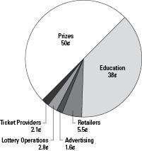
Figure 3-1:
Florida lottery expenditures (fiscal year 2001-2002).
To evaluate a pie chart for statistical correctness:
Bar Graphs
A bar graph is another means for summarizing categorical data. Like a pie chart, a bar graph breaks categorical data down by group, showing how many individuals lie in each group, or what percentage lies in each group.
Bar graphs are often used to compare groups by breaking down the categories for each and showing them as side-by-side bars. For example, has the percentage of mothers in the workforce changed over time? Figure 3-2 says yes and shows that the overall percentage of mothers in the workforce climbed from 47% to 72% between 1975 and 1998. Taking the age of the child into account, fewer mothers work while their children are younger and not in school yet, but the difference from 1975 to 1998 is still about 25% in each case.

Figure 3-2:
Percentage of mothers in workforce, by age of child (1975 and 1998 — data are from the U.S. Census).
Here is a checklist for evaluating bar graphs: