Statistics Essentials For Dummies (8 page)

Where the center of the data is (approximately)
The distribution of the data in a histogram
One of the features that a histogram can show you is the so-called
shape
of the data (in other words, how the data are distributed among the groups). Many shapes exist, and many data sets show a combination of shapes, but there are three major shapes to look for in a data set:
1.
Symmetric,
meaning that the left-hand side of the histogram is a mirror image of the right-hand side
2.
Skewed right,
meaning that it looks like a lopsided mound with one long tail going off to the right
3.
Skewed left
, meaning that it looks like a lopsided mound with one long tail going off to the left
Mothers' ages in Figure 3-4 for years 1975 and 2000 appear to be mostly mound-shaped, although the data for 1975 are slightly skewed to the right, indicating that as women got older, fewer had babies relative to the situation in 2000. In other words, in 2000 a higher proportion of older women were having babies compared to 1975.
Variability in the data from a histogram
You can also get a sense of variability in the data by looking at a histogram. If a histogram is quite flat with the bars close to the same height, you may think it indicates less variability, but in fact the opposite is true. That's because you have an equal number in each bar, but the bars themselves represent different ranges of values, so the entire data set is actually quite spread out. A histogram with a big lump in the middle and tails on the sides indicates more data in the middle bars than the outer bars, so the data are actually closer together.
Comparing 1975 to 2000, there's more variability in 2000. This, again, indicates changing times; more women are waiting to have children (in 1975 most women had their children by age 30), and the length of time waiting varies. (Chapter 2 discusses measuring variability in a data set.)
Variability in a histogram should not be confused with variability in a time chart. If values change over time, they're shown on a time chart as highs and lows, and many changes from high to low (over time) indicate lots of variability. So, a flat line on a time chart indicates no change and no variability in the values across time. But when the heights of histogram bars appear flat (uniform), this shows values spread out uniformly over many groups, indicating a great deal of variability in the data at one point in time.
Center of the data from a histogram
A histogram can also give you a rough idea of where the center of the data lies. To visualize the mean, picture the data as people on a teeter-totter; the mean is the point where the fulcrum has to be in order to balance the weight on each side.
Note in Figure 3-4 that the mean appears to be around 25 years for 1975 and around 27.5 years for 2000. This suggests that in 2000, Colorado women were having children at older ages, on average, than they did in 1975.
Evaluating a histogram
Here is a checklist for evaluating a histogram:
Boxplots
A
boxplot
is a one-dimensional graph of numerical data based on the five-number summary, which includes the minimum value, the 25th percentile (known as Q
1
), the median, the 75th percentile (Q
3
), and the maximum value. In essence, these five descriptive statistics divide the data set into four equal parts. (See Chapter 2 for more on the five-number summary.)
Making a boxplot
To make a boxplot, follow these steps:
1. Find the five number summary of your data set. (Use the steps outlined in Chapter 2.)
2. Create a horizontal number line whose scale includes the numbers in the five-number summary.
3. Label the number line using appropriate units of equal distance from each other.
4. Mark the location of each number in the five-number summary just above the number line.
5. Draw a box around the marks for the 25th percentile and the 75th percentile.
6. Draw a line in the box where the median is located.
7. Draw lines from the outside edges of the box out to the minimum and maximum values in the data set.
Consider the following 25 exam scores: 43, 54, 56, 61, 62, 66, 68, 69, 69, 70, 71, 72, 77, 78, 79, 85, 87, 88, 89, 93, 95, 96, 98, 99, and 99. The five-number summary for these exam scores is 43, 68, 77, 89, and 99, respectively. (This data set is described in detail in Chapter 2.) The vertical version of the boxplot for these exam scores is shown in Figure 3-5.
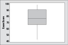
Figure 3-5:
Boxplot of 25 exam scores.
outliers —
numbers determined to be far enough away from the rest of the data to be noteworthy.